OWS Styling HOW-TO Guide: Colour Ramp Styles
Colour Ramps
A single continuous index is usually best visualised with a Colour Ramp. We looked at some unusual visualisations of NDVI (normalised difference vegetation index) in the last chapter, but a more traditional approach might look something like this:
Matplotlib Colour Ramps
Example: Bidirectional NDVI
ndvi_bidirection_cfg = {
    "index_function": {
        "function": "datacube_ows.band_utils.norm_diff",
        "mapped_bands": True,
        "kwargs": {"band1": "nir", "band2": "red"},
    },
    "mpl_ramp": "RdYlGn",
    "range": [-1.0, 1.0]
}
Here we apply a MatPlotLib named colour ramp “RdYlGn”. This is a diverging colour ramp
stretching from red through yellow to green, with the central yellow region being the brightest.
The ramp is applied linearly over the range -1 to 1.
For this example, this means that areas with negative NDVI will be red, positive areas green and areas close
to zero will be yellow.
We reference the supplied band_utils.norm_diff function, as discussed in the last chapter.
The full list of matplotlib named colour ramps can be found in the
Matplotlib documentation.
(Note that you can reverse the order of any ramp by adding the suffix _r. E.g. “RdYlGn_r” is the
same as “RdYlGn” except green is the low end of the scale and red the high end.)
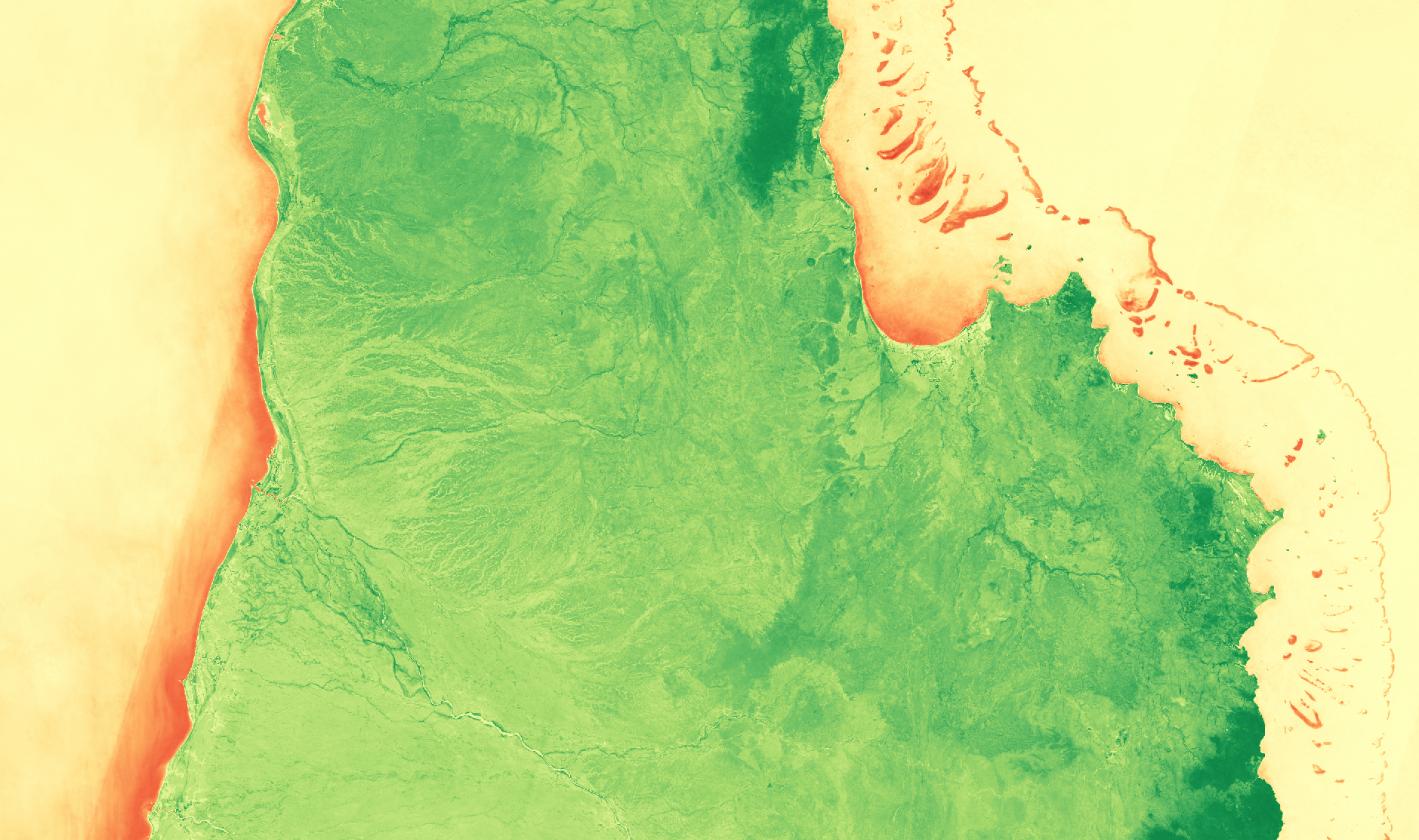
The green (positive) bits looks pretty good, but the zero/negative (yellow/red) bits aren’t that interesting.
Example: Unidirectional NDVI
Let’s make a few changes based on what we know so far. We shall:
Choose a new Matplotlib colour ramp.
Reverse the order of the Matplotlib ramp with the
_rsuffix.Change the range to
[0, 1.0]
The Matplotlib ocean ramp runs from dark green to dark blue, then fading to white.
so ocean_r is the reverse - from white through darker blues to dark green.
So now we get white in the negative and zero areas, with positive areas
getting darkening blues with close to 1.0 being dark green.
This configuration also demonstrates another method for defining the index - with a simple expression language instead of referencing an explicit python function. The expression language includes band names and literal numbers, as well as simple arithmetic operators like + - / * and parentheses for precedence.
ndvi_unidirection_cfg = {
    "index_expression": "(nir-red)/(nir+red)",
    "mpl_ramp": "ocean_r",    #  ocean_r is the "ocean" ramp, reversed.
    "range": [0.0, 1.0]
}
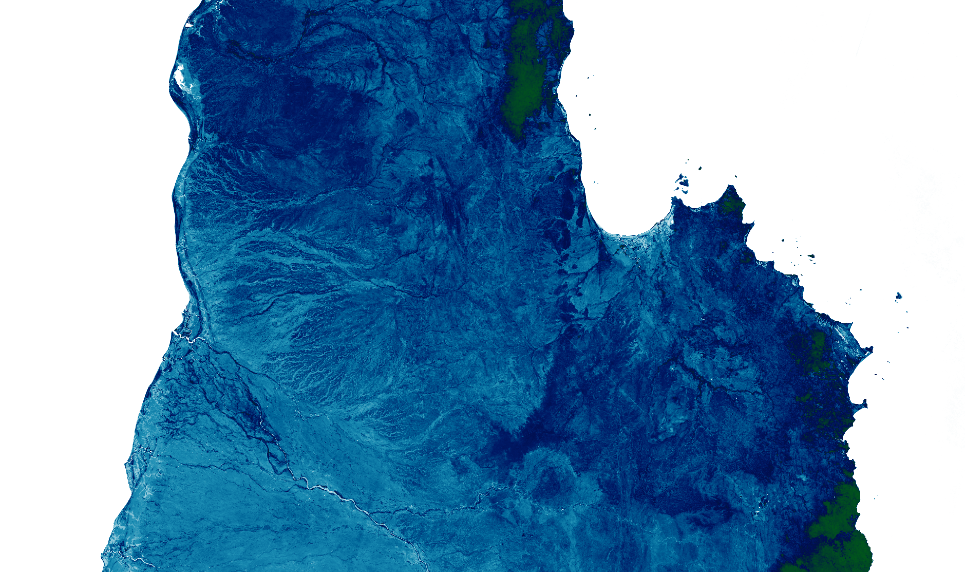
That’s a more informative visualisation of NDVI, but the choice of colour ramp doesn’t look particularly appropriate, in my opinion.
Custom Colour Ramps
Example - Custom Color Ramp
If nothing in matplotlib achieves exactly what you are after, or if you want to exaggerate certain portions of the scale, you can define a custom colour map:
ndvi_custom_ramp_cfg = {
    "index_function": {
        "function": "datacube_ows.band_utils.norm_diff",
        "kwargs": {"band1": "nir", "band2": "red"},
    },
    "color_ramp": [
        {"value": -1.0, "color": "#0000FF"},
        {"value": -0.2, "color": "#005050",},
        {"value": -0.1, "color": "#505050",},
        {"value": -0.01, "color": "#303030",},
        {"value": 0.0, "color": "black",},
        {"value": 0.01, "color": "#303000",},
        {"value": 0.5, "color": "#707030",},
        {"value": 1.0, "color": "#FF9090",},
    ]
}
For custom ramps, we use color_ramp instead of mpl_ramp, and we do not need a range
because that information is spelled out in manual colour ramp definition.
Each step in the colour ramp consists of a value and a color, with
the ramp ordered from lowest value to highest. The color can be
any valid HTML color string.
Let’s take a walk up the colour ramp, examining each step. Then we can look at the results.
"color_ramp": [
    # The ramp starts at -1.0 with bright blue.
    # Any values less than -1.0 would also be pegged at bright blue
    # (But -1.0 is the hard minimum for NDVI, so that is not relevant here.)

    {"value": -1.0, "color": "#0000FF"},

    # The next step is -0.2 which is a dark greenish blue.
    # Between -1.0 and -0.2 the colour is linearly interpolated,
    # gradually morphing from bright blue to dark greenish blue.

    {"value": -0.2, "color": "#005050",},

    # From -0.2 to -0.1, morph from the dark greenish blue to a dark grey at -0.01

    {"value": -0.1, "color": "#505050",},

    # I've deliberately spread out -0.01 to 0.01, so we can see if there is any
    # interesting fine detail in areas close to zero.
    # It morphs from dark grey (-0.1) to pure black (0.0), then brightens to a
    # a dark green.

    {"value": -0.01, "color": "#303030",},
    {"value": 0.0, "color": "black",},
    {"value": 0.01, "color": "#003000",},

    # Finally the positive value morphs from: dark green (0.01), to dark yellow (0.5) to
    # a salmony-pink by 1.0.

    {"value": 0.5, "color": "#707030",},
    {"value": 1.0, "color": "#FF9090",},

    # Values above 1.0 would be pegged at salmony-pink, but again, this does not apply
    # here because 1.0 is the absolute maximum value of NDVI (that's what the N means!)
]
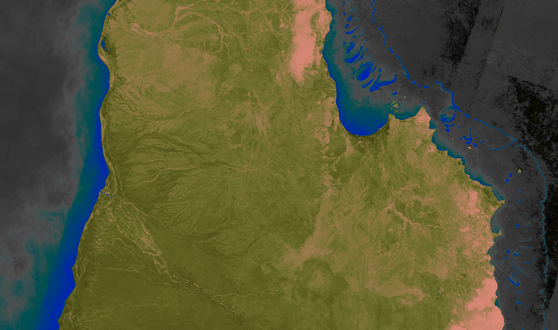
Oh well, looks like there’s nothing much interesting in that close-to-zero region. In fact, it would be nice if we could get rid of those bits all together, just leave those bits transparent, to show the next layer down on a webmap. For that, we need to start tapping into the alpha channel.
Example - Custom Colour Ramp with Alpha
You can add “alpha” to any step in your custom colour ramp. It takes a value between 0.0 and 1.0
where 0.0 is totally transparent and 1.0 (the default) is opaque. Note that you need to supply a
color even when alpha is 0.0.
ndvi_custom_ramp_alpha_cfg = {
    "index_function": {
        "function": "datacube_ows.band_utils.norm_diff",
        "kwargs": {"band1": "nir", "band2": "red"},
    },
    "color_ramp": [
        # For NDVI -1.0 to 0.0, the image is fully transparent.

        {
            "value": -1.0,
            "color": "#000000",
            "alpha": 0.0,
        },
        {
            "value": 0.0,
            "color": "#000000",
            "alpha": 0.0,
        },

        # For NDVI 0.0 to 0.1, the transparency gradually reduces to zero and colour
        # fades from black to dark blue.

        {
            "value": 0.1,
            "color": "#000030",
            "alpha": 1.0,
        },

        # For NDVI 0.1 to 0.3 colour brightens from dark blue to a dark purple

        {
            "value": 0.3,
            "color": "#703070",
        },

        # For NDVI 0.3 to 0.6 colour brightens from purple to yellow.

        {
            "value": 0.6,
            "color": "#e0e070",
        },

        # For NDVI 0.6 to 1.0 colour brightens from yellow to bright green.

        {
            "value": 1.0,
            "color": "#90FF90",
        }
    ]
}
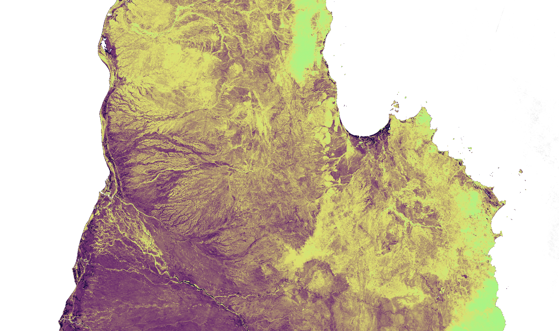
(The image is displayed here against a white background. When displayed on a webmap, those white pixels would show the next layer down on the map. The full size view shows the image against a grey background on most browsers, which may help to convey the sense of transparency.)
Next up, colour-map styles , which are useful for visualising discrete measurement bands.